La Meva Salut
La Meva Salut
Collection of user experience improvements for Catalonia’s health system
Collection of user experience improvements for Catalonia’s health system

External services (Altres serveis)
Improving the flow to connect with external services
External services (Altres serveis)
Improving the flow to connect with external services
External services (Altres serveis)
Improving the flow to connect with external services
Team
Team
Santi Mirabet - Product designer
Santi Mirabet - Product designer
Date
Date
May 2024 - July 2024
May 2024 - July 2024
Overview
Overview
The process for contacting external services that are part of the public medical sector within La Meva Salut, was unintuitive and impractical.
My task was to simplify the process as much as possible, making it clear for users while respecting the existing functioning and its technical requirements.
The process for contacting external services that are part of the public medical sector within La Meva Salut, was unintuitive and impractical.
My task was to simplify the process as much as possible, making it clear for users while respecting the existing functioning and its technical requirements.
The process for contacting external services that are part of the public medical sector within La Meva Salut, was unintuitive and impractical.
My task was to simplify the process as much as possible, making it clear for users while respecting the existing functioning and its technical requirements.
Going with the (user) flow.
Going with the (user) flow.
Due to technical requirements, the process had to be split into two steps:
First, the service had to be enabled among all the available ones (meaning: running the query to allow La Meva Salut to connect with the external service).
Then, once enabled, users could actually access the service's web page.
Due to technical requirements, the process had to be split into two steps:
First, the service had to be enabled among all the available ones (meaning: running the query to allow La Meva Salut to connect with the external service).
Then, once enabled, users could actually access the service's web page.
Due to technical requirements, the process had to be split into two steps:
First, the service had to be enabled among all the available ones (meaning: running the query to allow La Meva Salut to connect with the external service).
Then, once enabled, users could actually access the service's web page.


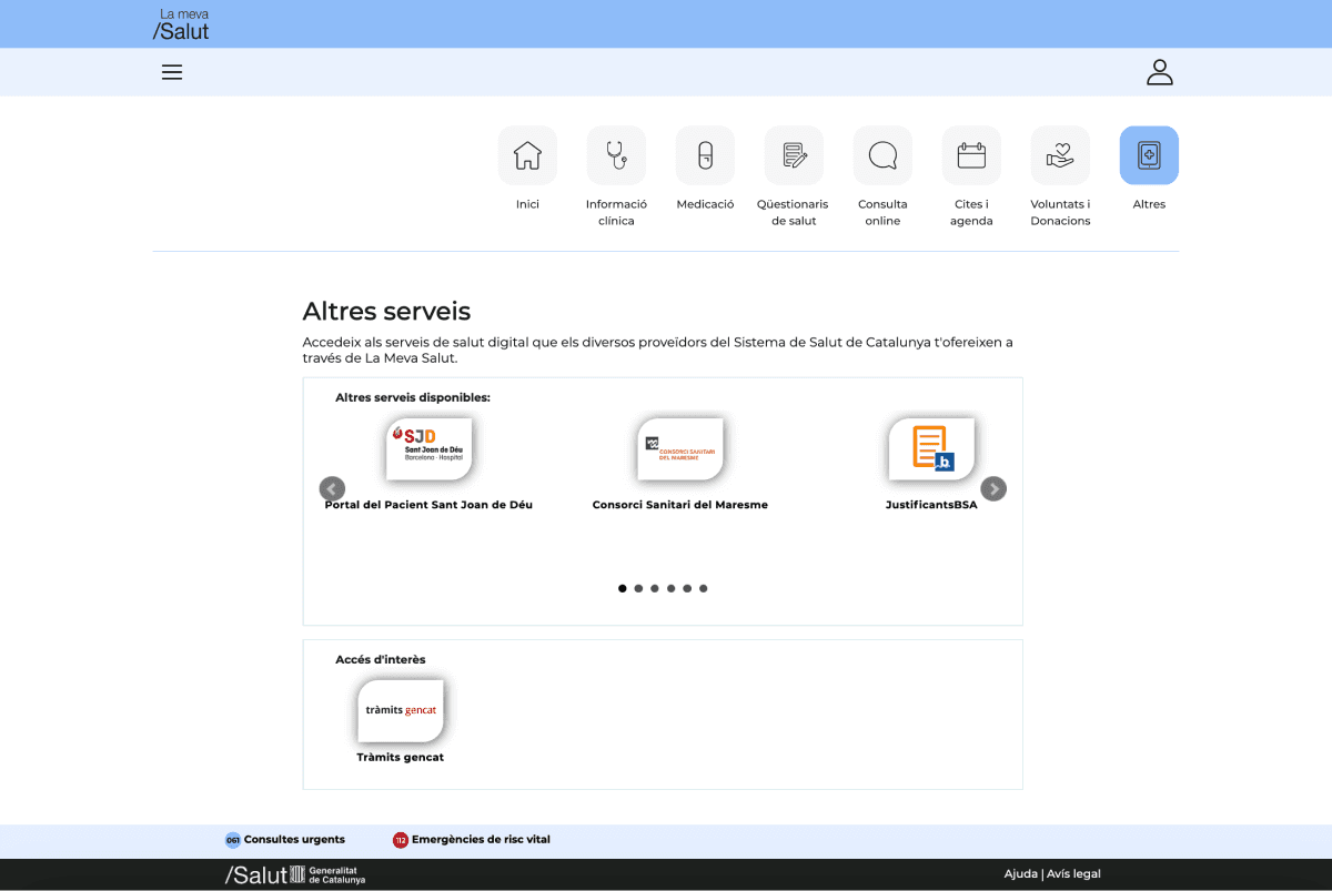
UX audit of the existing flow
Desktop
Mobile
Previous
Locate
Enable
Access
Next


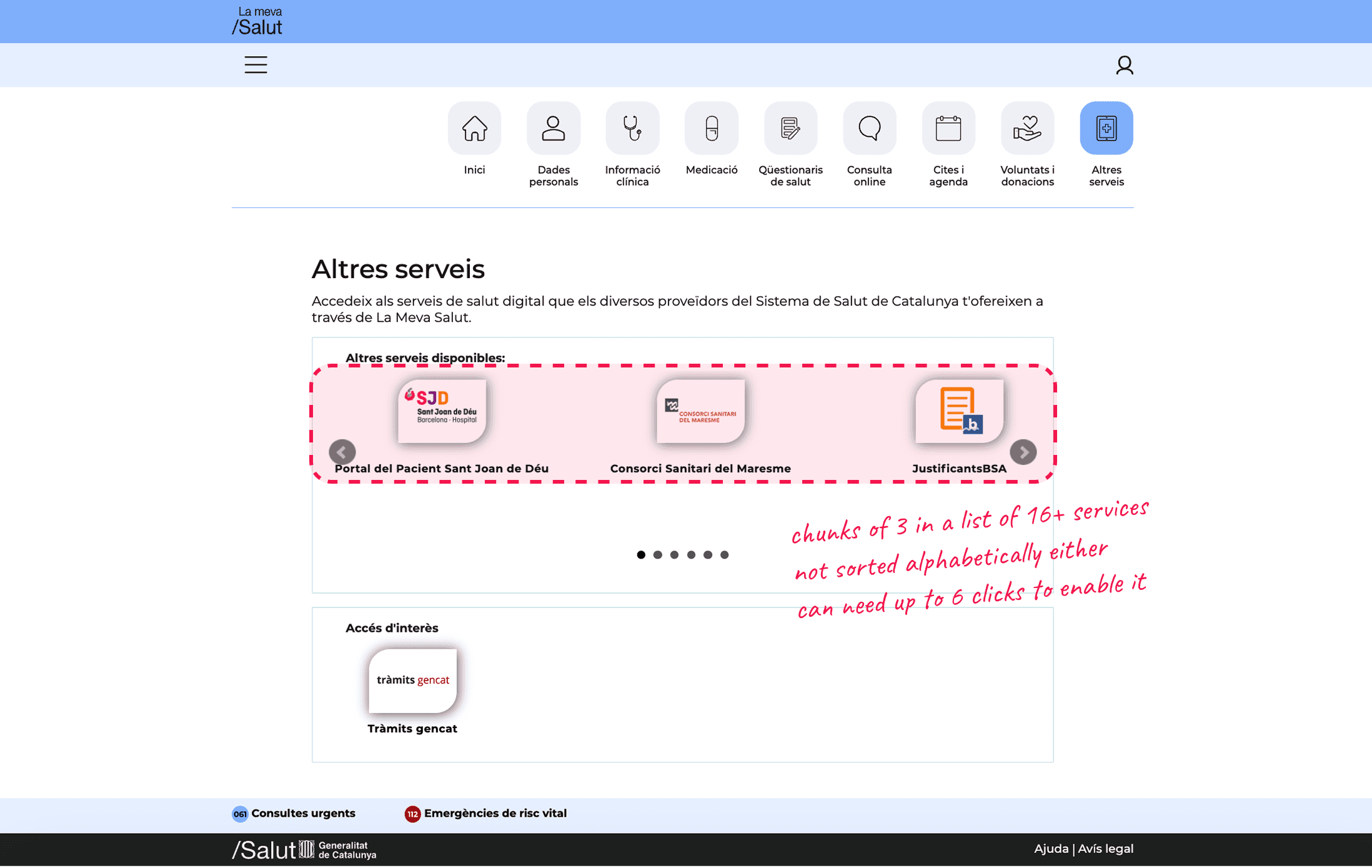


Issues to solve
Lack of information about the service unless the user clicks on it.
Only 3 options visible at a time from an unsorted list.
Unknown consequences of clicking on the cards.
Confusing way to put information about other non-medical procedures.
General UI issues: singular design, spacing inconsistencies, lack of interactions, overlapping items...
UX audit of the existing flow
Desktop
Mobile
Previous
Locate
Enable
Access
Next
Issues to solve
Lack of information about the service unless the user clicks on it.
Only 3 options visible at a time from an unsorted list.
Unknown consequences of clicking on the cards.
Confusing way to put information about other non-medical procedures.
General UI issues: singular design, spacing inconsistencies, lack of interactions, overlapping items...
UX audit of the existing flow
Desktop
Mobile
Previous
Next
Locate
Enable
Access
Issues to solve
Lack of information about the service unless the user clicks on it.
Only 3 options visible at a time from an unsorted list.
Unknown consequences of clicking on the cards.
Confusing way to put information about other non-medical procedures.
General UI issues: singular design, spacing inconsistencies, lack of interactions, overlapping items...
Sticking to the standards.
Sticking to the standards.
The method I used to develop the new proposal was to ask myself what design criteria the layout should follow so users would understand how everything worked from the start, without needing any kind of guidance.
In other words: follow design standards, best practices and common sense.
The method I used to develop the new proposal was to ask myself what design criteria the layout should follow so users would understand how everything worked from the start, without needing any kind of guidance.
In other words: follow design standards, best practices and common sense.
The method I used to develop the new proposal was to ask myself what design criteria the layout should follow so users would understand how everything worked from the start, without needing any kind of guidance.
In other words: follow design standards, best practices and common sense.
“Is it a group of elements sharing the same format?”
“Is it a group of elements sharing the same format?”
Make it a vertical list. They are easy to scan and scrolling is less frictional than clicking through arrow buttons.
Make it a vertical list. They are easy to scan and scrolling is less frictional than clicking through arrow buttons.
“Do services only have two states, enabled/disabled?“
“Do services only have two states, enabled/disabled?“
Then don't use a modal to choose between them, just use a toggle. It's the clearest and most common way to switch between binary states.
Then don't use a modal to choose between them, just use a toggle. It's the clearest and most common way to switch between binary states.
“How will the user know that, in order to access the service, it must be enabled first?”
“How will the user know that, in order to access the service, it must be enabled first?”
The link will be displayed from the start, but it will remain disabled as long as the toggle is off.
The link will be displayed from the start, but it will remain disabled as long as the toggle is off.
“Is the service nested inside La Meva Salut or is it an external site?”
“Is the service nested inside La Meva Salut or is it an external site?”
The service component should show the link with an “external URL” icon.
The service component should show the link with an “external URL” icon.
The answers to these questions combined with the problems I had identified in the analysis of the existing flow ultimately shaped the design proposal:
The answers to these questions combined with the problems I had identified in the analysis of the existing flow ultimately shaped the design proposal:
The answers to these questions combined with the problems I had identified in the analysis of the existing flow ultimately shaped the design proposal:
Final design
Desktop
Mobile
Previous
Locate
Enable
Access
Next


Final design
Desktop
Mobile
Previous
Locate
Enable
Access
Next
Final design
Desktop
Mobile
Previous
Next
Locate
Enable
Access
Not to brag about it, but...
Not to brag about it, but...
The proposal brought improvements across the board.
The proposal brought improvements across the board.
The proposal brought improvements across the board.
Service activations increased by an average of 6.1% from the month the changes were implemented on the website.
Service activations increased by an average of 6.1% from the month the changes were implemented on the website.
Service activations increased by an average of 6.1% from the month the changes were implemented on the website.
As of the writing of this case study (two years later), the design is still in use and hasn’t been modified in any aspect.
As of the writing of this case study (two years later), the design is still in use and hasn’t been modified in any aspect.
As of the writing of this case study (two years later), the design is still in use and hasn’t been modified in any aspect.
The results of this work led to my contract being extended and to me being brought onto other La Meva Salut projects.
The results of this work led to my contract being extended and to me being brought onto other La Meva Salut projects.
The results of this work led to my contract being extended and to me being brought onto other La Meva Salut projects.

More projects
More projects
